Park Logo
Project Brief
The objective for this project was to develop a logo system and brand identity for a park. The park can fall under the themes of recreational, conservational, nature preservation, urban, or wildlife habitat. After establishing the type of park, we must collectively create a brand identity for our park through research. This includes establishing our competition, target audience, amenities, and so forth. Once our brand is determined, we begin drafting a concept. The concept includes naming the park, creating a main logo, and a system of logo subsidiaries. Once we have created a name and identity for our park, the next phase is creating visual ideas such as logo formats and variations. Lastly, a series of critiques are set in place to help determine our final logo format that strongly supports our concept.
Building Logo Name and Identity
Part of the brainstorming process was to create a name exploration chart. This chart is similar to mind mapping, which allows us to visually organize information into a hierarchy, showing relationships among parts of the whole. In this case, this technique helped determine the overall feel of our brand and our company name. We laid out words that describe our company and that are associated with the tone we were trying to achieve. During this process, it was important to keep our audience in mind and choose words that would catch their attention. After much discussion and research, we chose The Grounds Family Adventure as our name.
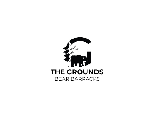
Our team developed a brief of who we are as a company which is as stated: The Grounds is an outdoor adventure park located in Humboldt County, California. Our park offers many activities suitable for families with children of all ages. Our 10-acre property consists of four subdivisions that are designed to engage everyone in your family. We have a variety of attractions, ranging from ziplines and an aerial playground to lagoon activities such as water slides and paddle boarding. If you don't want the experience to stop, we offer week-long passes that include full park entry as well as a stay in one of our cozy cabins in the Bear Barracks.
Exploring Typography & Imagery
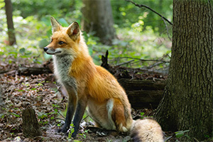
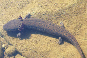
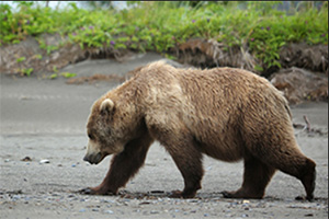
For this part in the process, I began researching imagery associated with the outdoors, specifically in the location where our company is located. I've taken inspiration from animals, textures, and nature surrounding that region. I began to navigate towards what type of logo would best suit this concept, whether it would be image or type-driven, and what elements would help show the viewers exactly what we are. Below are some inspirational examples of typography and imagery.
Typeface Options
Textiles and Imagery
Drafting Process
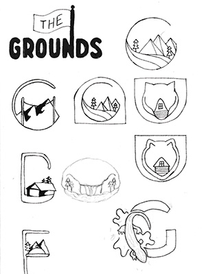
The initial step in the drafting process is to create sketches of possible logos. Sketching out ideas is an important step in the branding process because it helps visualize the logo. This process will lead to building a visual that will represent the company to the public. For this project, I started with typically small thumbnail sketches of ideas that first came to my mind after reading the concept brief. Once the initial sketches were complete, I took several of the thumbnail sketches and redrew them on a larger scale with more detail to make certain elements more clear. This allowed me to explore different line weights, shapes, and typography to get a broad sense of what I wanted for my design. I even created different variations of the same logo and played with several levels of abstraction.
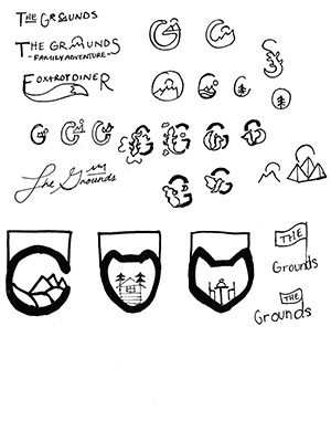
Logo Sets
After receiving feedback from peers and the professor, I iterated on the sketches and made necessary changes to improve the design. The next step was to choose three options that had the most potential to move forward. These three logo options will be refined further to make them more polished and professional. This process involves tweaking the design elements such as size, type, and layout. To create a cohesive brand identity system, we must develop subsidiaries for each of the three logos. These subsidiaries can include variations of the main logo or be different logos with similar elements. It is important to create a set of guidelines to ensure consistency in the logo system and ensure they communicate the intended message to the target audience.
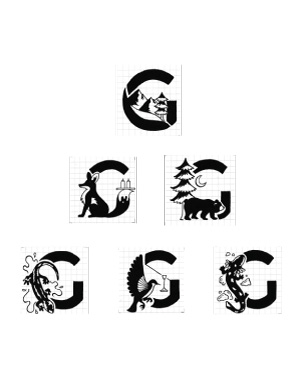
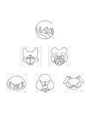
I decided to choose three options that were significantly different from one another to explore variety. The first set of logos is type-drive and contains a playful typeface with a general sans-serif for the tagline. Although the typography was a favorite, the name length of each subsidiary posed a difficulty in legibility and consistency. The second set of logos uses a great contrast between shapes and has enough abstraction to tell what the elements are. The last set of logos is strictly linework that focuses on force connections. These logos aim to combine animals with nature/architectural elements.
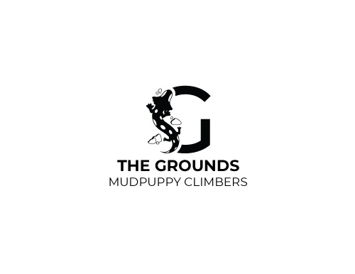
Final Logo and Subsidiaries
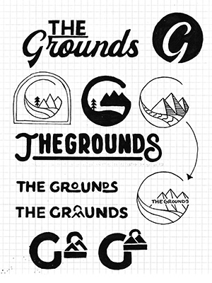
Choosing the final logo was a challenging yet exciting task. After several iterations and designs, I narrowed it down to the second logo set, which I felt captured the brand's essence. During the digital process, I realized that some of the initial designs were too intricate and decided to take away some details to simplify the overall design. I ensured that every element served a specific purpose and contributed to the overall look and feel of the logo. Lastly, I adjusted certain details to help make the system work as a whole such as stroke width, shape, and solid elements.
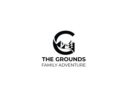
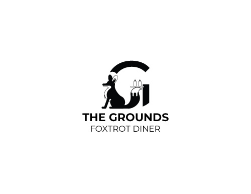
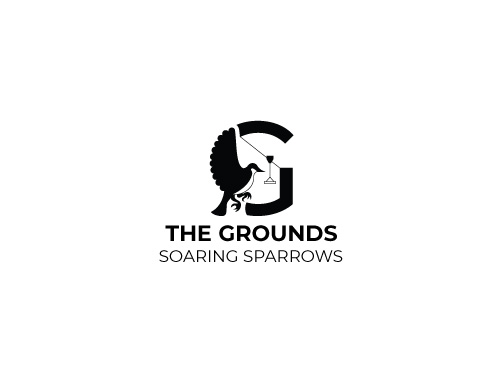
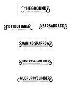
Towards the finalization of the logos, a group agreement was made to drop one subsidiary from the company. We found that two of the subsidiaries were very similar and that one would be more beneficial than the other. Overall, the decision was an effective choice which helped the logos work better as a system. The final result is shown below with the main logo on the left. The right image shows the main logo with four subsidiaries that correlate with different attractions of the adventure park.
Conclusion
The completion of this project was both an exciting and challenging process. It showed me how to think strategically when creating a logo system. I learned how to work as a team to develop a brand identity. I was able to produce a strong visual by combining my research and design abilities. My main goal was to create logos that would work well together and convey my overall message. Nonetheless, I enjoyed putting the components together and designing the illustrations; I always look forward to including these types of designs in my work. I also got to experiment more with typography and use decorative typefaces. Another phase of the design process that I found interesting was research. I learned to effectively write a company brief and create an elevator pitch for our company. It was a great experience to work with other design students and collectively put our ideas together. Overall, I am pleased with the outcome of my final design.